It’s a common scenario: you have never heard about Gantt charts. Then, when writing a PhD application or planning your PhD timeline for the upcoming years, someone suggests: You should include a Gantt chart! No need to worry. Here is all you need to know about Gantt charts for your PhD timeline.
Contents
What are Gantt charts?
A Gantt chart is a visual representation of a project schedule and a widely used tool in project management.
Gantt charts belong to the family of bar charts. In a Gantt chart, bars depict different project tasks. The length of each bar is proportionate to the task duration and indicates both start and finish dates.
Gantt charts are named after Henry Gantt. He lived from 1861-1919 and developed these types of charts as part of his work as a management consultant.
Why are Gantt charts frequently used for PhD timelines?
A Grantt chart is a great way to provide an overview of project tasks, activities and milestones.
Gantt charts are frequently used to illustrate PhD timelines because doing a PhD essentially means creating, managing and implementing a project with many components over several years.
Therefore, Gantt charts are popular tools among (aspiring) PhD students.
They are often featured in PhD proposals: Through visual representations, Gantt charts help communicate milestones, plans and estimated task durations.
Furthermore, Gantt chart PhD timelines allow PhD students to track their progress. They can also help PhD students to stay on track with their work.
You may also like: How to develop an awesome PhD timeline step-by-step
What information is included in Gantt charts for PhD timelines?
Gantt charts can include all kind of information, based on the specific project they are focusing on. When it comes to Gantt chart PhD timelines, there are several elements that are commonly featured:
- Extensive PhD proposal/plan
- Data collection
- Experiments
- Data analysis
- Writing plan
- Publications
- Conferences
- Courses/Coursework
Of course, every PhD project is unique. This uniqueness should be reflected in your Gantt chart. For instance, your Gantt chart PhD timeline will look different if you write a PhD based on articles or if you write a monograph.
For a PhD based on published articles, different bars in a Gantt chart PhD timeline could for example represent individual papers. For a monograph, it may be smarter to focus on research stages.
How do you create a Gantt chart for your PhD timeline?
Creating a PhD timeline Gantt chart in Microsoft Excel
Unfortunately, creating a Gantt chart in Microsoft Excel is far from straightforward as Excel does not provide its own Gantt chart template.
You can create a table, turn it into a bar chart and manually edit it until it looks like a Gantt chart. If you have some experience with Excel, it is doable. Detailed instructions on the process can be found in this manual from Ablebits.com.
However, why go through all the hassle when you can simply download a template? You can use Microsoft’s own free Gantt project planner template and adjust it to your PhD project.
Creating a PhD timeline Gantt chart in Microsoft PowerPoint
Manually creating a PhD timeline Gantt chart in PowerPoint is a bit easier than in Excel. Therefore, I will explain the process here.
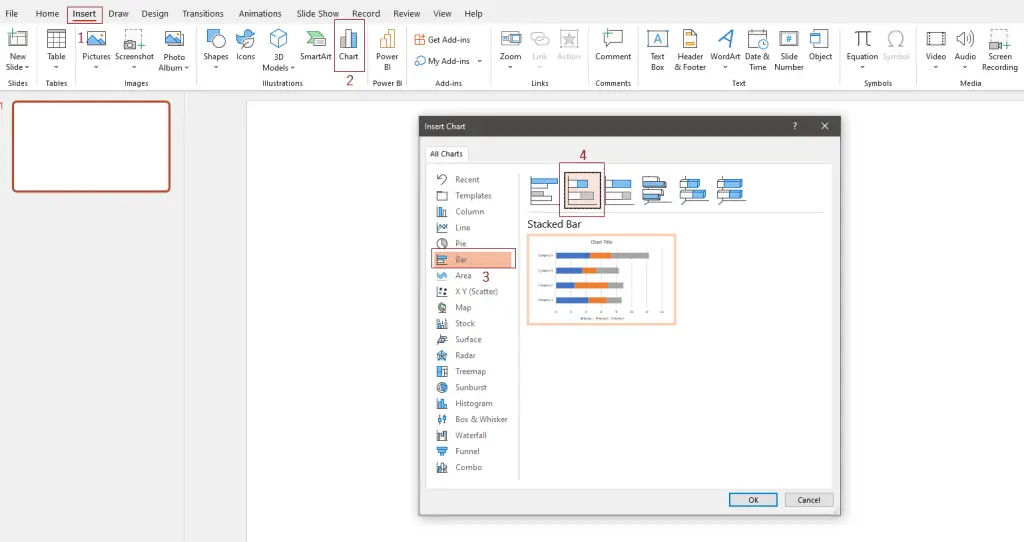
First, you need to open a blank PowerPoint slide. Then click on Insert (1.), then Chart (2.). A popup will appear. Select Bar (3.) and finally select the Stacked Bar option (4).
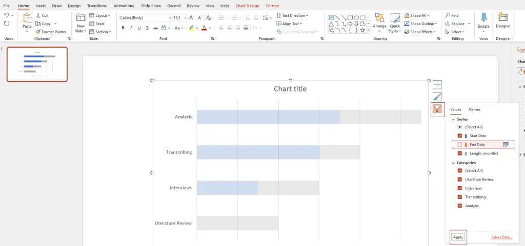
A standard bar chart will appear on your slide and a small Excel table with open next to it. The first column in the Excel table is called Categories. You can replace categories with the PhD tasks that you want to display. For instance, Literature Review, Interviews, Transcribing and Analysis. You can add more categories or delete existing ones by removing a row in the small Excel table.
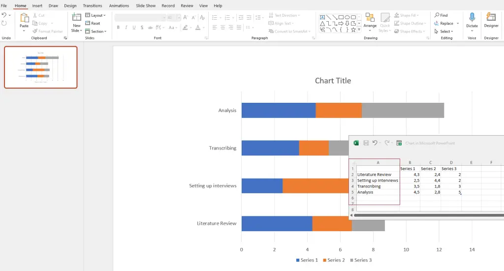
Next to the Categories (now tasks) column, you see three more columns: Series 1, Series 2, Series 3. You can use these columns to showcase the length of tasks. Rename Series 1 into Start Date and Series 2 into End Date. Series 3 indicates the overall length. Depending on the timeframe you want to showcase, you can opt for instance for Length (weeks) or Length (months).
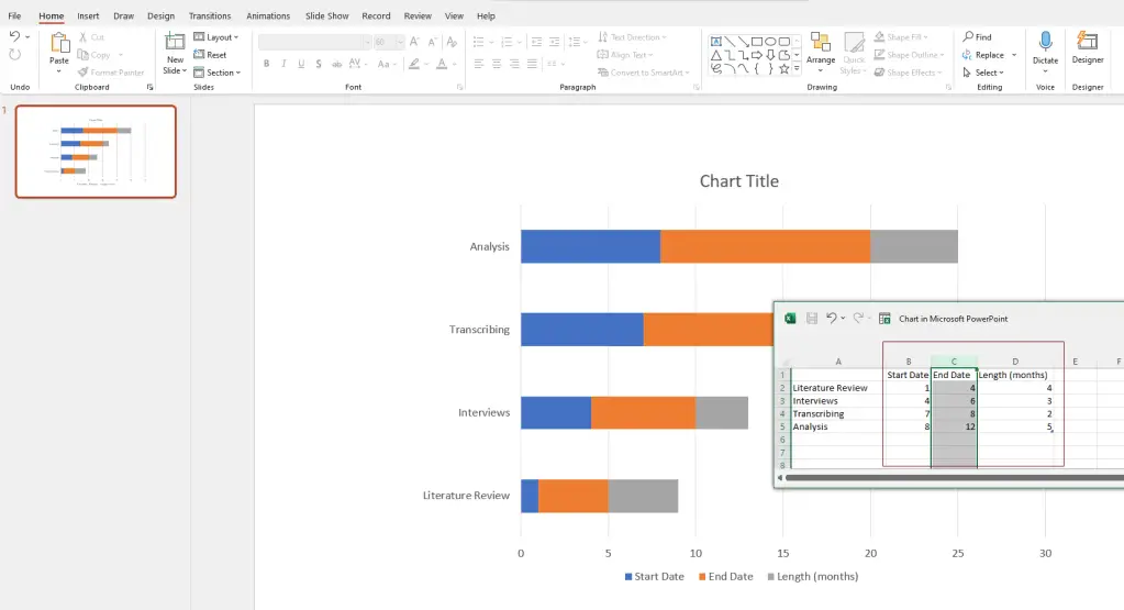
In the example below, I decided to plan PhD tasks for a year. Thus, 1 means January, 2 means February, 3 means March and so forth. The length of tasks is also indicated in months:
Next, click on your chart and three icons will appear in the upper-right corner next to it. Click on the bottom one, the Chart filters, remove the tick of the check box of End Date, and click on Apply. You will see that the bar chart will start to look like a Gantt chart:
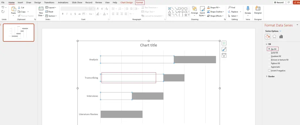
Now, the blue parts of the bar, indicating the Start Dates, need to be removed. Just click on one of them, and on the righthand side, Format Data Series should appear. Select No fill. Alternatively, in the upper menu, select Format, go to Shape fill, and select No fill.
Now comes the fun part, namely decorating. You can add a chart title, colour the bars in the colour of your choice, edit the legend and the axis descriptions. Just play with it to explore the options.
One more thing I did was changing the value of the axis, because I want to illustrate the months of a year. Thus, it was a bit weird that the horizontal axis started with 0 and ended with 13 while I needed 1-12 to indicate each month of a year. You can simply change this by clicking on the axis. On the righthand side, Format Axis will appear. Go to Axis Options, Bounds, and enter 1 for Minimum and 12 for Maximum.
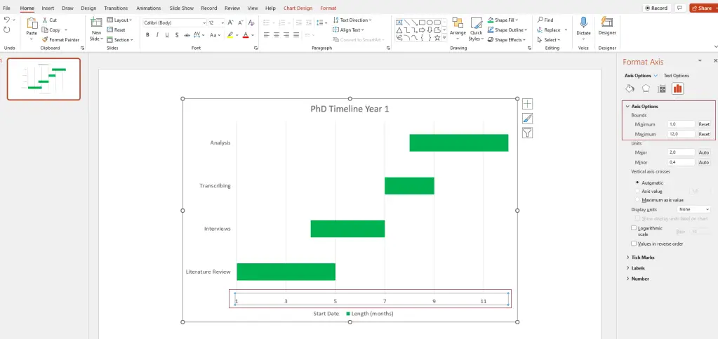
And voila! Your Gantt chart is ready.
Creating a PhD timeline Gantt chart in a Microsoft Word
The nice thing about learning how to create a Gantt chart in Microsoft PowerPoint is that you basically teaches you how to create one in a Word file as well! The process is very similar.
To start the process in Word, it is smart to first change the orientation of your page to Landscape. In the top menu, click on Layout, then select Orientation, then choose Landscape.
Next, select Insert, then Chart, and select a Stacked Bar chart again.
A basic bar chart will appear on your page:
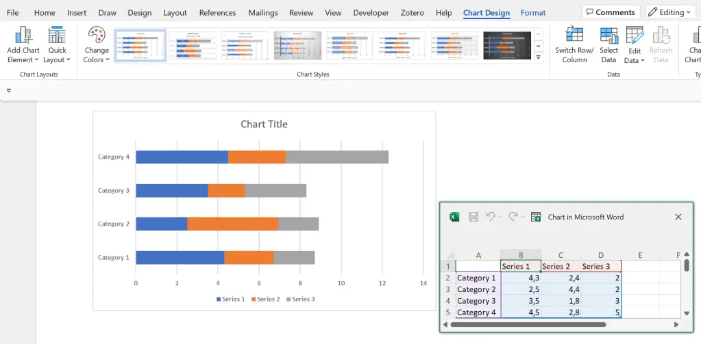
Looks familiar? Yes! From here, it is basically the same process as editing the bar chart in PowerPoint.
Creating a PhD timeline Gantt chart with an online tool
If you don’t want to go through the hassle of creating your own Gantt chart but are not convinced by any templates, you can make use of online tools and software.
There are some paid providers out there, but in my opinion, it is not worth paying to create an awesome PhD timeline.
You can use a free provider (or make do with one of the many Gantt chart templates that exist on the internet). One free online tool is the Free Online Gantt Chart Software:
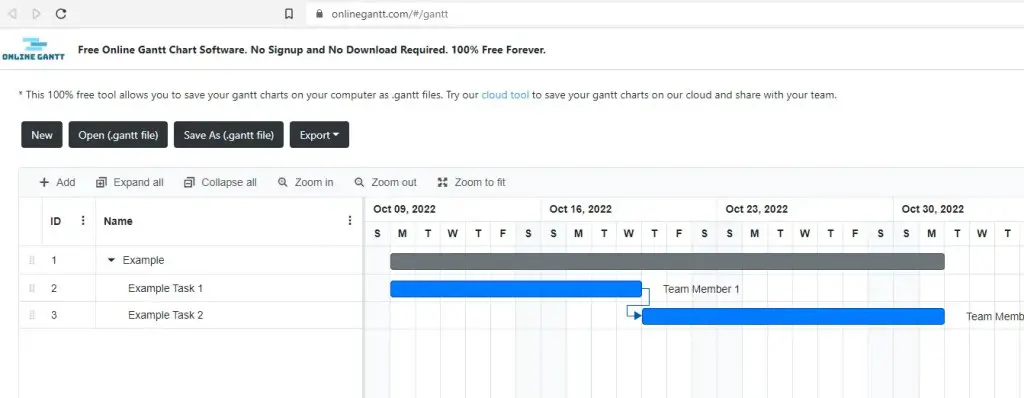
The site requires no signup. You can editing and simply start filling in the Gantt chart, and export it as an Excel, Image or PDF file when you are done!
PhD timeline Gantt chart templates
Best Gantt chart template for PhD timelines in Microsoft Excel
A great way to create a detailed Gantt chart in Microsoft Excel is by using Microsoft’s free Gantt project planner template. The level of detail and functionality exceeds those of simple, manually created Gantt charts. This makes this type of Gantt chart especially useful to track detailed PhD progress.
Best Gantt chart template for PhD timelines in Microsoft PowerPoint
A useful Gantt chart template for PhD timelines in PowerPoint can be downloaded here via OfficeTimeline.com This Gantt chart is particularly great to provide a rough overview of plans over a longer period. For instance, with a few edits, you can illustrate a nice 3-year PhD timeline.
Best Gantt chart template for PhD timelines in Microsoft Word
Useful Gantt chart templates for Microsoft Word can be downloaded here from TemplateLAB. I like these templates as they can be easily adjusted to the needs of a PhD timeline. For instance, a weekly Gantt chart template can be useful to establish a detailed plan with weekly objectives to keep your PhD progress on track.
PhD timeline Gantt chart examples
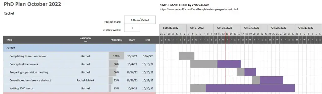
Gantt chart PhD timeline example in Microsoft Excel
Using the template provided by Microsoft above, an example PhD timeline to track regular progress on tasks could look, for instance, like this:
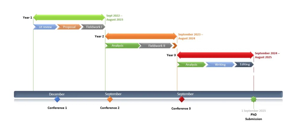
Gantt chart PhD timeline example in Microsoft PowerPoint
Using the Gantt chart PowerPoint template by OfficeTimeline.com above, an example PhD timeline to present a plan for a 3 year PhD could look, for instance, like this:
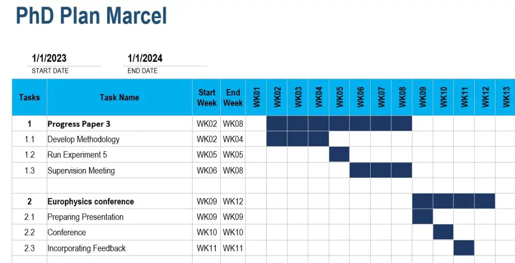
Gantt chart PhD timeline example in Microsoft Word
Using a weekly Gantt chart template from TemplateLab mentioned above, an example PhD timeline with weekly tasks and objectives could look, for instance, like this: